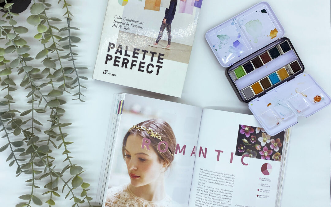
In the world of branding, colours play a significant role in shaping perceptions, emotions, and brand recognition. Crafting a captivating color palette is essential for creating a memorable brand identity. In this blog post, we explore the importance of a well-curated color palette, and we recommend the book “Palette Perfect” by Lauren Wager as a valuable resource to help you find the perfect colors for your brand.
Colours have the power to evoke specific emotions and influence how people perceive your brand. Understanding colour psychology is crucial when developing your brand’s visual identity. Warm colors like red and orange can convey passion and energy, while cool colors like blue and green evoke a sense of calmness and reliability. By strategically selecting colors that align with your brand values and message, you can create a strong emotional connection with your audience.
These are some common associations and emotions often linked to different colors, taking into consideration the psychology of color:
-
Red: Often associated with passion, energy, excitement, and urgency. It can evoke feelings of power, love, and intensity. Red can also stimulate appetite and grab attention, making it a popular choice in the food and retail industries.
-
Orange: Symbolizes enthusiasm, creativity, and warmth. It can create a sense of friendliness and approachability. Orange is often used to convey a playful and energetic vibe, making it suitable for brands targeting a youthful audience.
-
Yellow: Radiates positivity, optimism, and happiness. Yellow is known to uplift moods and evoke feelings of joy and cheerfulness. It can also grab attention and stimulate mental activity, making it ideal for brands promoting optimism and creativity.
-
Green: Associated with nature, growth, and harmony. Green often represents freshness, balance, and renewal. It can evoke feelings of tranquility, health, and eco-friendliness. Green is commonly used by brands related to the environment, health, and wellness industries.
-
Blue: Symbolizes trust, stability, and calmness. Blue is often associated with reliability, intelligence, and professionalism. It can evoke a sense of peace and serenity. Many corporate and financial institutions use blue in their branding to convey a sense of trustworthiness and security.
-
Purple: Often linked to luxury, creativity, and spirituality. Purple is associated with royalty and elegance. It can evoke feelings of imagination, creativity, and mystery. Purple is commonly used by brands in the beauty, fashion, and creative industries.
-
Pink: Symbolizes femininity, tenderness, and compassion. Pink is often associated with sweetness, nurturing, and romance. It can evoke feelings of playfulness and charm. Pink is commonly used in branding aimed at female audiences and industries related to beauty and fashion.
-
White: Symbolizes purity, simplicity, and cleanliness. White is often associated with innocence, clarity, and perfection. It can evoke feelings of calmness and spaciousness. White is commonly used in minimalist and clean branding, as well as industries related to healthcare and technology.
-
Black: Represents sophistication, elegance, and authority. Black is often associated with power, strength, and professionalism. It can evoke a sense of luxury and exclusivity. Many high-end brands use black as a primary or secondary color in their branding.
Remember that these associations can vary across cultures and personal experiences. When selecting colors for your brand, consider your target audience, industry, and brand values to create a color palette that resonates with your desired emotions and perceptions.
A well-defined color palette ensures consistency across all brand touchpoints, including your logo, website, marketing materials, and packaging. Consistency in color usage builds brand recognition and strengthens your brand’s visual identity. When customers consistently associate your brand with specific colors, it becomes easier for them to recognize and remember you, setting you apart from competitors.
Also, your color palette helps define your brand’s personality and sets the tone for your communication. Bright and vibrant colors may indicate a playful and energetic brand, while muted and pastel hues can suggest sophistication and elegance. By selecting colors that align with your target audience’s preferences and resonate with your brand values, you can effectively communicate your brand’s personality and create a lasting impression.
To assist you in finding the ideal color palette for your brand, we recommend the book “Palette Perfect” by Lauren Wager. This insightful resource explores various color combinations, provides practical tips for creating harmonious palettes, and guides you through the process of selecting colors that best represent your brand. “Palette Perfect” offers inspiration, guidance, and a wealth of knowledge to help you find a visually stunning and cohesive color palette.
In conclusion, a captivating color palette is a cornerstone of successful branding. It sets the mood, creates an emotional connection, and enhances brand recognition. Take the time to understand the psychology of colors and curate a color palette that aligns with your brand’s personality and values. And don’t forget to check out “Palette Perfect” by Lauren Wager to gain valuable insights and inspiration on your color exploration journey. Let your brand shine with a carefully crafted color palette that leaves a lasting impression.

